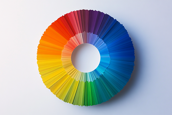
Color is one of the most powerful languages in graphic design. It goes beyond aesthetics—it communicates emotions, creates associations, and influences decisions. Understanding color psychology allows brands to communicate with intention, connect with their audience, and build more meaningful visual identities.
What is color psychology?
It is the study of how colors affect people’s emotions, perceptions, and behaviors. In graphic design, this translates into the strategic selection of color palettes to create impact.
Colors and their common meanings
- Red: passion, energy, urgency. Ideal for calls to action
- Blue: trust, calm, professionalism. Common in finance and tech brands
- Yellow: optimism, creativity, youth. Great for grabbing attention
- Green: health, growth, sustainability. Used by eco and wellness brands
- Black: elegance, luxury, sophistication. Popular in fashion and premium products
- Pink: softness, femininity, warmth. Widely used in beauty and emotional brands
- Orange: energy, accessibility, enthusiasm. Works well for startups and approachable brands
Color palettes and consistency
Color combinations are just as important as individual tones. Monochromatic, analogous, complementary, or triadic palettes help define a brand’s visual style and consistency.
Color psychology in brand identity
A conscious brand uses color to reflect its personality, values, and emotional tone. It’s not about choosing what looks good—it’s about choosing what communicates and connects.
For example, a brand focused on sustainability may use greens and earthy tones to reinforce its message.
Successful examples
- Coca-Cola: Red to convey energy, action, and youth
- Spotify: Vibrant green for freshness and modernity
- Tiffany & Co.: Signature blue to communicate luxury and differentiation
Be mindful of cultural context
Color meanings can vary across cultures. For example, white represents purity in Western cultures, but it can be associated with mourning in some Asian countries.
Conclusion
Color is not decoration—it’s communication. Applying color psychology strategically transforms graphic design into a powerful tool for emotional connection.
Brands that master this visual language position themselves more effectively and resonate deeply in both the minds and hearts of their audience.