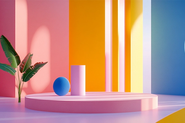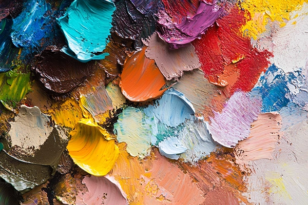
Choosing a color palette is one of the most powerful—and sensitive—decisions in visual design. It’s emotion, structure, and brand. In 2025, AI tools promise to generate “perfect” combinations in seconds… but can AI really replace intuition, context, and designer intent?
Generative palette AI has become a common resource in branding, UI, editorial, and social media workflows. Platforms like Khroma, Coolors, Canva AI, and Adobe Firefly generate palettes based on trends, emotions, images, or keywords.
But this raises a critical question:
Are we designing with intention—or just accepting the first suggestion the machine gives us?
What Is Generative Palette AI?
It’s a tool that uses algorithmic models to propose color combinations based on defined inputs:
- Text prompts (e.g., “minimal and sophisticated”)
- Reference images
- Learned personal preferences
- Current trends
- Emotions or moods
The goal: speed up color selection while offering visually and technically viable options.
Advantages of Using AI for Color Palettes
1. Faster exploration
Breaks creative blocks with instant variations.
2. Controlled variation
Generate multiple versions with subtle shifts in tone, saturation, or temperature.
3. Time efficiency
No need to start from scratch—experimentation becomes faster.
4. Trend alignment
Many tools are trained on contemporary visual datasets, keeping results “current.”
Risks You Can’t Ignore
1. Lack of context
AI doesn’t know if you’re designing for a bank, a kids brand, or an Indian restaurant. A palette can look good—but feel completely wrong.
2. Visual homogenization
Same tools → same outputs → same brands.
Result: safe palettes, forgettable identities.
3. No functional awareness
Contrast, accessibility, legibility? Not always guaranteed.
4. Emotional disconnect
Great color doesn’t just look right—it feels right.
AI still doesn’t understand that layer.
How to Use AI as an Ally (Not a Crutch)
- Define intention first
What should this design feel like? - Use AI to explore, not decide
Let it suggest—but you choose. - Validate technically
Check contrast, accessibility, and cross-platform behavior. - Adapt to cultural context
Color means different things depending on the audience. - Refine and personalize
AI is a starting point—not the final answer.
🎨 Esbozo approach: we use AI to explore initial directions—but refine every color through strategy, competitive context, and brand DNA.
AI Palette Tools to Watch in 2025
- Khroma → Learns your taste
- Coolors AI → Keyword + color theory
- Colormind → UI-focused palettes
- Adobe Firefly → Prompt-based generation
- Designify → Product-based recommendations
What’s Next? Adaptive Color Systems
The future points toward dynamic palettes that adapt to:
- Screen lighting
- User mood
- Time of day
- Location
Yes—color that responds in real time.
But even then, designer oversight remains non-negotiable.
Conclusion
AI Suggests. You Decide.
Design is still a discipline of judgment, sensitivity, and context.
AI-generated palettes are powerful—if used with intention.
But they should never replace your voice as a designer.
At Esbozo, we don’t “pick” color—we build it.
From emotion, function, and strategy.
AI can help you move faster.
But the direction? That’s always yours.