Graphic design is a complex discipline that requires attention to many details. Making mistakes can negatively impact how a brand is perceived and reduce the effectiveness of a design. Here are some of the most common graphic design mistakes—and how to avoid them.
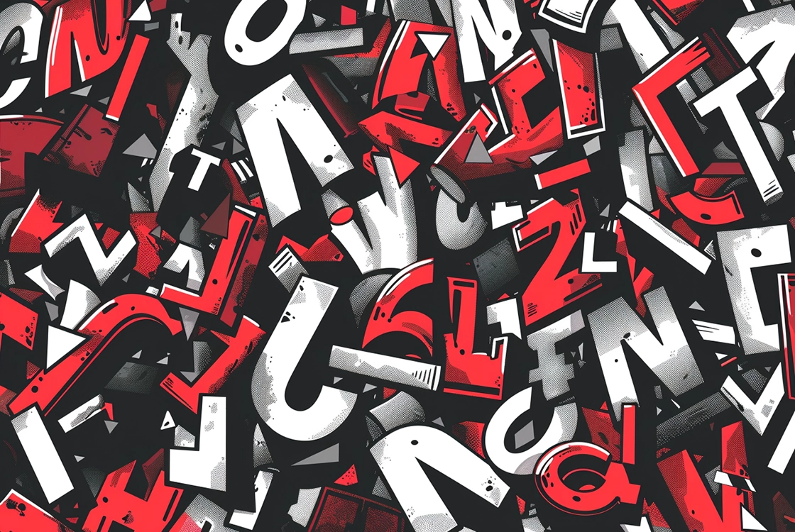
Overusing Fonts
One of the most common mistakes is using too many fonts in a single design. This can make the design look cluttered and unprofessional. To avoid this, limit yourself to two or three fonts and ensure they are legible and complement the overall design.
Lack of White Space
White space, or negative space, is essential for giving your design room to breathe. Without enough white space, a design can feel crowded and difficult to read. Use white space intentionally to create a clean, balanced layout that highlights key elements.
Poor Visual Hierarchy
Visual hierarchy helps guide the viewer through the design by emphasizing the most important information. Without a clear hierarchy, a design can feel confusing. Use font sizes, colors, and strategic placement to direct attention to the most important elements.
Poor Color Choices
Choosing the wrong colors—or using too many—can clash and reduce readability. It’s important to understand color theory and use combinations that are both visually appealing and effective. Tools like Adobe Color can help you create harmonious palettes.
Generic Stock Images
Overusing stock images can make your design feel generic and inauthentic. Whenever possible, use custom visuals that align with your brand identity and maintain high quality. This adds a unique and professional touch to your design.
Ignoring File Formats
Choosing the wrong file format can affect design quality, especially when it comes to scalability and compatibility. For example, logos should be created in vector formats like SVG or AI to ensure they look sharp at any size and across all mediums.
Not Testing Across Devices
A design that looks great on a large screen may not perform well on mobile devices. Always test your designs across different devices and screen resolutions to ensure a consistent and effective user experience.
Conclusion
Avoiding these common mistakes can significantly improve the quality and effectiveness of your graphic designs. The key is to pay attention to detail, use the right tools and techniques, and always consider the perspective of the end user.