Hello, creatives and design enthusiasts! Today we’re going to dive into the world of layout in graphic design—a fundamental aspect that can undoubtedly elevate the quality of our projects to new heights. Layout isn’t just about placing visually appealing elements on a page; it’s about communicating effectively, creating harmony and balance that captivates the audience. So, if you’re ready to explore these basic concepts and transform your designs, join me on this educational and entertaining journey!
Visual Hierarchy
The first step in the art of layout is understanding the importance of visual hierarchy. This principle allows us to guide the viewer’s eye through the most important elements of our design, using size, color, and contrast. For example, a large, bold headline will grab attention before the smaller text in a paragraph. Establishing a clear hierarchy ensures that your main message never gets lost in the crowd.
Balance and Visual Weight
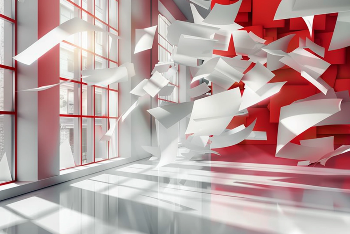
Balance is key to avoiding designs that feel overloaded or empty. By distributing graphic and textual elements evenly, we create a harmonious composition. There are two main types: symmetrical balance, which divides the page into equal sections, and asymmetrical balance, which uses elements of different sizes and colors to create a balanced yet dynamic composition.
Alignment
Alignment is the invisible thread that ties all the elements of your design together, creating an orderly and cohesive structure. Whether you align text to the left, right, center, or justify it, this principle helps create a polished look that makes reading and visual navigation easier. Remember, a well-aligned design is like a well-conducted orchestra: every element in perfect harmony.
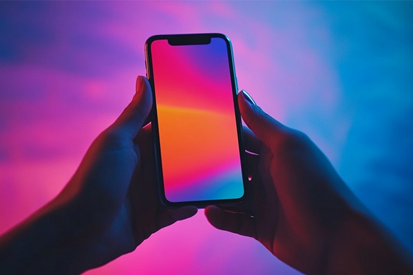
Contrast
Contrast is the drama of the design world, the element that adds emotion and emphasizes importance. Through the use of contrasting colors, varying sizes, or different textures, we can make certain aspects of our design stand out, capturing the audience’s attention and making our message unforgettable.
Repetition
Repetition is not only the mother of skill, but also a pillar of good design. Repeating visual elements or styles throughout a piece creates cohesion and reinforces your design’s concept. Think of repetition as the chorus of your favorite song: a familiar element that invites you to keep reading, looking, and enjoying.
Proximity
Proximity is the principle that encourages us to group related elements, making the message easier to understand. By keeping elements that share a function or message together, we help our audience process information more efficiently, improving the user experience and visual communication.
The Art of Organization
Mastering the basics of layout in graphic design is essential for any creative professional who wants to communicate effectively and create work that is not only visually appealing but also functionally flawless. Remember, every project is an opportunity to experiment with and apply these principles, transforming ideas into memorable visual experiences.
So, whether you’re designing the next groundbreaking website, an eye-catching invitation, or an informative infographic, keep these layout concepts in mind. With practice and patience, you’ll see your designs rise from the ordinary to the extraordinary. Happy designing, and may your creativity flow endlessly!