Five seconds.
That’s all the time your brand has to capture attention on a Reel, Short, or TikTok before the user scrolls away.
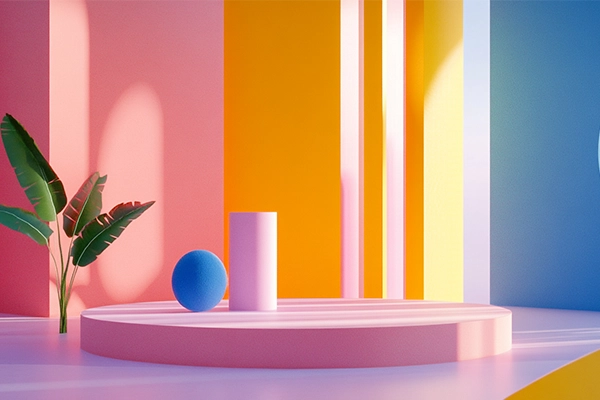
In that instant, design, rhythm, and message must work as a single system.
The challenge is real: creating microvideos that don’t just look good—but communicate an idea, trigger an emotion, or drive action… in just a few seconds.
Mastering this is no longer optional. It’s essential.
What Are Microvideos—and Why Do They Matter?
Microvideos are ultra-short content pieces (3 to 10 seconds) designed to grab attention instantly.
They’re used for:
- Teasers
- Ads
- Hooks
- Standalone content
Their purpose is simple:
- Capture attention immediately
- Deliver a clear message
- Drive interaction (watch, click, engage)
In a world of endless scrolling, every second must be intentional.
How to Make an Impact in the First 5 Seconds
1. Start with a Powerful Visual
Your first frame needs to hit hard.
- Use striking imagery (faces, contrast, bold gestures)
- Apply large, legible typography
- Avoid slow fades—start strong
💡 Think of it as an animated thumbnail.
2. Compress the Message to the Extreme
Don’t explain. Don’t build up. Don’t introduce.
Get straight to the point.
Instead of:
“Let us show you how to optimize your logo with AI…”
Say:
“Your logo isn’t working. This fixes it.”
Short, sharp, direct = higher retention.
3. Design for Motion, Not Static
A microvideo is a fast sequence of stimuli.
Your design should guide the eye through movement:
- Use dynamic text animation
- Create smooth but energetic transitions
- Sync visuals with sound (beats, voice, effects)
🌀 It’s not about adding more—it’s about creating flow.
4. Treat Text as a Visual Tool
Many users watch without sound.
Your text must carry the message too.
- Add subtitles if there’s voiceover
- Use typographic hierarchy
- Avoid placing text where UI elements cover it
Text isn’t support—it’s part of the design.
5. Introduce the CTA Immediately
In microvideos, there’s no “later.”
Your call to action should appear from the beginning or be embedded throughout:
- “See it now”
- “Watch what we did to this logo”
- “Have you redesigned yours yet?”
- “Swipe to see the before/after”
CTA can be visual, textual, or emotional—but it must exist.
Common Mistakes to Avoid
- Long intros with animated logos (no one waits)
- Reusing horizontal content without vertical adaptation
- Low-contrast text (unreadable)
- Ignoring sound design
- Overloading the video with too many elements
Recommended 5-Second Microvideo Structure
1–2 sec → Strong visual + emotional hook
3–4 sec → Message development (transformation, comparison, reaction)
5 sec → Logo, CTA, or visual twist
This structure can vary—but the flow must always feel intentional and fast.
Brands Doing It Right
- Canva: Quick design tips with clear text and fast animation
- Notion: Product features explained in under 10 seconds
- Sephora: High-impact micro tutorials synced with trending audio
- Burger King: Bold humor, big typography, brand present from second one
Conclusion
In Microvideo Design, Every Second Is Everything
You don’t need 60 seconds to tell a story.
With the right visual structure, sound, and message, your brand can leave an impact in just five.
At Esbozo, we don’t see this as adaptation—we see it as a new discipline.
Because in today’s feeds,
you don’t compete for minutes…
you compete for seconds.