Hello design enthusiasts and color explorers! Color is one of the most powerful elements in graphic design. It can evoke emotions, communicate messages, and create a unique visual identity.
For beginners, understanding how to use color effectively may seem complex—but with the right guidance, you can start leveraging its power in your design projects. Ready to dive in? Let’s explore the role of color and how to use it to make your designs stand out.
The Meaning of Color: A Palette of Emotions
Every color carries meaning and can trigger specific emotional responses. Understanding these associations will help you choose the right palette for your designs.
- Red: Represents passion, energy, and action. It can also signal danger or urgency.
- Blue: Conveys calm, trust, and professionalism. Commonly associated with technology and business.
- Green: Suggests nature, growth, and health. It’s calming and often linked to sustainability.
- Yellow: Evokes happiness, optimism, and warmth. It can also indicate caution.
- Orange: Combines the energy of red with the joy of yellow. Represents creativity and enthusiasm.
- Purple: Suggests luxury, elegance, and spirituality. Often seen as imaginative and inspiring.
- Black: Represents sophistication, power, and elegance. It can also evoke mystery.
- White: Symbolizes purity, simplicity, and cleanliness. A versatile and neutral color.
How to Choose the Right Color Palette
Step 1: Define the Design Objective
Before selecting colors, determine the message you want to communicate. Should your design feel vibrant and energetic—or calm and refined? Your goal will guide your color decisions.
Step 2: Know Your Audience
Your target audience plays a key role in color selection. Different demographics may respond differently to certain colors. Research your audience to ensure your palette resonates with them.
Step 3: Experiment with Color Combinations
Once you understand your message and audience, start exploring combinations. Some classic approaches include:
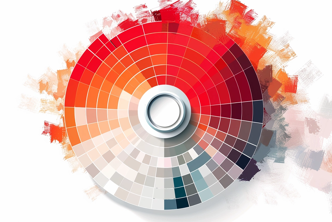
- Complementary colors: Opposites on the color wheel (e.g., blue and orange) create strong contrast.
- Analogous colors: Colors close to each other (e.g., blue and green) create harmony.
- Monochromatic: Variations of a single color for a subtle and elegant effect.
Step 4: Ensure Contrast and Readability
Contrast is essential for readability and accessibility. Make sure your colors provide enough contrast so text and elements are easy to read. Use online tools to check contrast ratios and ensure your design is accessible to all users.
Using Color Across Different Design Contexts
The role of color varies depending on the type of design:
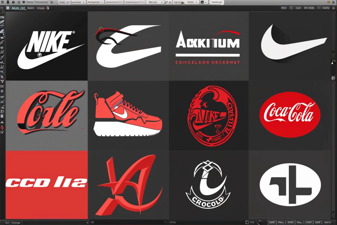
- Logos: Color defines brand identity and enhances memorability.
- Web design: Well-chosen colors improve user experience and navigation.
- Advertising: Bold colors grab attention and increase message impact.
- Editorial design: Color guides the reader and enhances visual engagement.
Color as a Design Tool
Color is a powerful design tool capable of transforming an ordinary concept into something extraordinary. Understanding how to use it effectively is essential for any graphic designer.