Logo design is essential for building a strong visual identity. In Colombia, several brands stand out with logos that are not only visually appealing but also connect effectively with their audiences. Below, we explore ten of the most iconic logos from Colombian companies.
Avianca: Balancing Modernity and Tradition
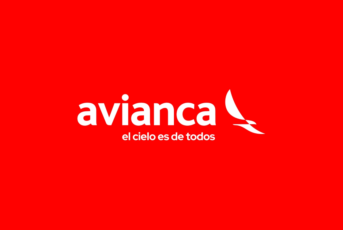
Avianca’s logo has evolved to reflect the airline’s modernization while preserving its essence. The current design features fluid shapes that evoke movement, while the red and white colors represent energy and trust. This logo is strongly associated with Avianca’s legacy and leadership in Colombia’s aviation industry.
Grupo Éxito: Simplicity and Approachability
Grupo Éxito’s logo is a perfect example of how simplicity can be powerful. Its vibrant yellow color symbolizes optimism and positivity, while the friendly typography reinforces a sense of closeness with customers. The small black dot, representing “success,” is instantly recognizable across the country.
Bancolombia: Financial Strength with a Human Touch
Bancolombia’s logo uses blue, yellow, and red to represent stability, optimism, and passion. Its curved shapes and geometric elements convey financial strength while maintaining a sense of accessibility and human connection.
Postobón: A Refreshing Legacy
Postobón’s logo has maintained a strong identity over time. With bold lettering and its iconic pink color, it evokes freshness, dynamism, and tradition. Its simplicity keeps it modern and effective within the beverage industry.
Alpina: Nature and Purity
Alpina’s logo maintains a strong connection to nature through organic shapes and soft colors. The use of blue and white conveys purity and freshness, aligning perfectly with its mission to offer healthy, natural products.
Sura: Trust and Professionalism
Sura’s logo is minimalist yet impactful. The dominant blue color communicates trust and reliability, while the rounded typography adds a sense of warmth and accessibility. This identity has helped position Sura as one of the leading insurance companies in the country.
Colpatria: Strength and Dynamism
Colpatria’s logo is bold and dynamic, featuring geometric shapes that convey energy. Its red color represents power and action, while the concentric circle symbol suggests integrity and financial protection.
Davivienda: Innovation with Cultural Roots
Davivienda’s logo stands out for its innovative character, combining modern typography with a symbol that references Colombian cultural roots—specifically the “Casa de Altos del Gualí.” This blend of modernity and tradition has strengthened its position in the financial sector.
Totto: Youthful Creativity
Totto’s logo, with its fresh and youthful style, perfectly reflects the brand’s spirit. Rounded shapes and vibrant colors communicate dynamism and creativity, making it especially appealing to younger audiences.
Ecopetrol: Natural Energy
Ecopetrol’s logo, featuring its iconic green iguana, is directly associated with nature and environmental commitment. The green and yellow color palette conveys renewable energy and sustainability—key elements of the company’s identity.
Protecting a Logo in Colombia
Protecting a logo in Colombia requires registering the design with the Superintendence of Industry and Commerce and considering copyright protection. These steps ensure exclusivity and provide legal security against potential infringements.