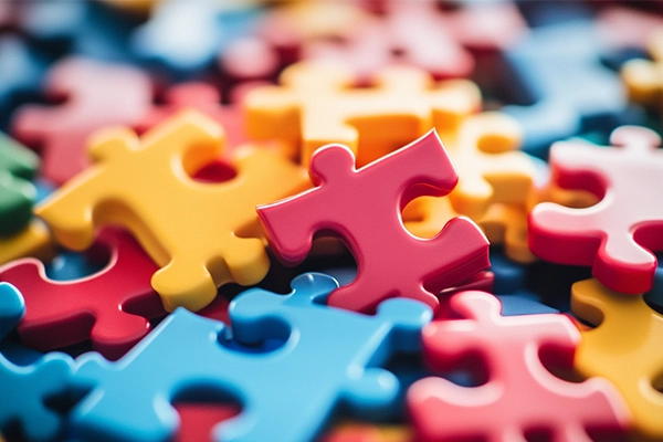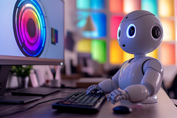
Color is one of the most powerful elements in design. It can evoke emotions, establish hierarchy, and reinforce brand identity. Traditionally, selecting color palettes has been a creative and intuitive process led by the human eye. However, artificial intelligence (AI) is transforming this stage of design with tools that generate automatic color combinations based on algorithms, color psychology, and visual trends.
Does this mean designers are losing creative control? Not necessarily. In this article, we explore the balance between automation and human intuition in generating color palettes.
Advantages of Using AI to Generate Color Palettes
- Speed and rapid exploration: AI-powered tools can generate hundreds of combinations in seconds, making it easier to explore different styles.
- Data-driven insights: Some systems analyze visual trends across social media, design galleries, and reference platforms to deliver up-to-date and cohesive palettes.
- Accessibility and contrast: Certain AI tools are trained to suggest combinations that meet visual accessibility standards.
- Time savings in testing: By generating alternatives quickly, designers can focus on curating and refining rather than starting from scratch.
Popular Tools
- Khroma: Learns your color preferences and suggests personalized combinations.
- Coolors: Generates automatic palettes and allows you to adjust variables such as brightness and saturation.
- ColorMind: Uses neural networks trained on real designs and films to create context-aware combinations.
And What About the Designer’s Role?
While AI automates part of the process, it cannot replace the communicative intent or cultural context that a human designer brings. Choosing colors for a luxury brand, a children’s app, or a social movement requires sensitivity, visual storytelling, and experience.
AI suggests. The designer decides.
The best approach is to combine both capabilities: use AI to expand possibilities, then validate and refine based on the project’s needs. The final color selection should carry strategic, emotional, and cultural meaning.
Recommended Use Cases
- Creating mood boards or early-stage explorations
- Projects with tight deadlines
- Co-creation processes with clients who want to visualize options
- Projects that require visual accessibility
Conclusion
AI doesn’t replace the designer’s judgment—it enhances it. By handling repetitive tasks and expanding visual possibilities, it allows designers to focus on what truly matters: communicating with intention, evoking emotion, and connecting with audiences. Designing with AI is not about choosing between automation or human input—it’s about integrating both to achieve better visual and communicative outcomes.