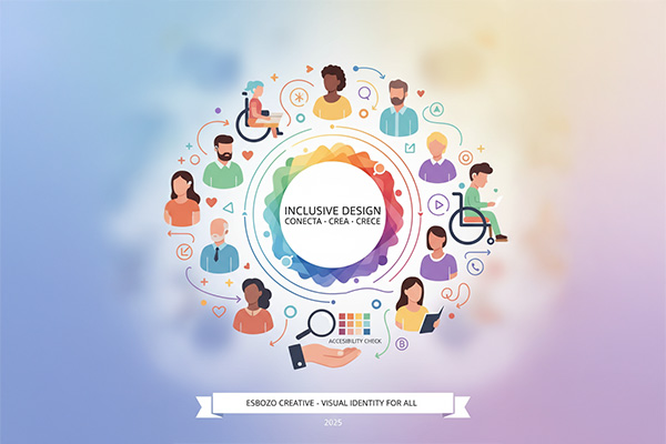
In a globalized and increasingly diverse world, brands can no longer afford to design without considering inclusion. An inclusive visual identity is not only an ethical decision—it’s a competitive advantage that connects with audiences across different backgrounds, ages, genders, and abilities.
Creating an inclusive visual identity means building a graphic system that is accessible, representative, and respectful—without falling into stereotypes or exclusions. In this article, we explore how to design a visual identity that reflects diversity, equity, and accessibility through color, form, typography, and symbols.
Why an inclusive visual identity matters
Brands today are focused on building long-term relationships and communities. Visual representation plays a key role because it:
- Builds empathy – People connect with what reflects their reality
- Creates emotional trust – Inclusive brands feel more human
- Breaks barriers – It reaches audiences that have historically been overlooked
Inclusive design isn’t just about “doing the right thing”—it’s about understanding diversity as a powerful communication asset.
1. Color as an inclusive tool
Color is one of the most powerful elements in design. It communicates emotion, culture, and accessibility.
Cultural meaning and context
- Colors have different meanings across cultures
- For example, red can symbolize prosperity in many Asian cultures, while in others it may signal danger
Representing diversity
- Use color palettes that reflect a wide range of skin tones
- Avoid limiting representation to a narrow set of tones
Accessibility in color
- Ensure sufficient contrast for readability
- Avoid color combinations that are difficult for people with color blindness
💡 Esbozo tip: Use tools like WebAIM Contrast Checker to validate accessibility.
2. Inclusive typography: clarity and usability
Typography is not just about style—it’s about readability and access.
Choose legible fonts
- Prefer sans-serif fonts like Inter, Roboto, or Open Sans
- Avoid overly decorative fonts for long texts
- Use appropriate sizes for comfortable reading
Think mobile-first
- Many users consume content on small screens
- Test readability across devices
💡 Esbozo tip: Use relative units (em or rem) to ensure typography adapts to different screen sizes.
3. Shapes and symbols: avoid stereotypes
Visual elements also shape perception.
Avoid stereotypes
Instead of reinforcing clichés:
- Use gender-neutral representations
- Include diverse physical features and skin tones
- Represent different abilities and conditions
Use universal symbols
- Prefer simple, widely understood forms (circles, arrows, hearts)
- Avoid culturally exclusive or ambiguous symbols
4. Representation: reflect the real world
An inclusive visual identity should represent diversity in:
- Age
- Gender
- Ethnicity
- Social background
- Sexual orientation
- Physical and cognitive abilities
Generational diversity
Different generations engage with content differently. Avoid designing for just one age group.
LGBTQ+ representation
Include authentic and respectful representation of diverse identities to position your brand as open and modern.
Conclusion
In 2025, inclusion is not just ethical—it’s essential for building strong, relevant brands.
An inclusive visual identity reflects a brand that understands its audience and is prepared for the future.
At Esbozo, we see inclusive design not as a limitation, but as an expansion.
Because when design includes more people, it doesn’t just communicate better—
it connects deeper.