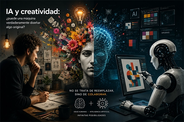
Logos are not just visual representations of a brand—they communicate emotions, values, and messages through colors and shapes. The psychology behind logo design is essential for creating impact. Understanding how people perceive visual elements can make the difference between a memorable logo and one that goes unnoticed.
The Power of Color in Logos
Each color triggers a different emotional response:
- Red: conveys energy, passion, and urgency (e.g., Coca-Cola)
- Blue: builds trust and professionalism (e.g., Facebook, Bancolombia)
- Green: associated with nature, freshness, and growth (e.g., Spotify)
- Yellow: symbolizes optimism and attention-grabbing energy (e.g., Postobón)
Brands should choose colors that align with their values and resonate with their target audience.
The Influence of Shapes on Visual Perception
Geometric shapes also play a crucial role:
- Circles: evoke unity, harmony, and community (e.g., Nespresso)
- Squares and rectangles: represent stability and balance (e.g., Microsoft)
- Diagonal lines: suggest movement and dynamism (e.g., Nike)
The Effective Combination of Colors and Shapes
A strong logo balances both elements to reinforce its message. For example, Amazon’s logo combines friendly rounded typography with a yellow arrow connecting the “A” to the “Z,” symbolizing that they offer everything you need.
The Importance of Culture and Context
Color meanings can vary depending on cultural context. In Colombia, green is strongly associated with nature and biodiversity, while in some Asian cultures it may represent luck and prosperity.
Conclusion
A successful logo communicates the right message through a strategic combination of colors and shapes that connect with its audience. Understanding visual psychology allows brands to create logos that are not only effective but also memorable and enduring.