Color is a fundamental factor in logo design. Beyond aesthetics, colors influence how a brand is perceived, creating emotional and subconscious associations in consumers. Choosing the right color palette can directly impact a brand’s identity, recognition, and trust.
In this article, we’ll explain how color psychology works in logos, what different colors represent, and how to choose the perfect palette for your business.
Why is color psychology important in logos?
Colors don’t just make a design look good—they communicate meaning. A study by the Institute for Color Research suggests that up to 85% of consumers make purchasing decisions based on color.
Benefits of choosing the right colors:
- Improves brand recall
- Reinforces brand identity and values
- Creates an emotional connection with customers
- Influences purchasing decisions
The color of a logo can define whether a brand is perceived as trustworthy, innovative, or luxurious.
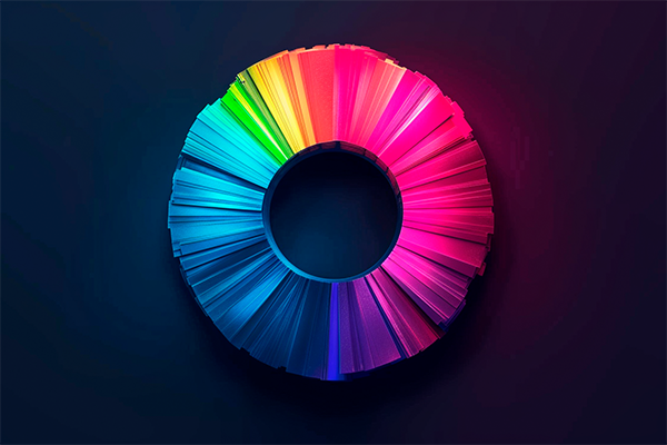
Meaning of colors in logo design
Each color has a different psychological impact. Here’s what they typically represent in branding:
- Red: Passion, energy, and urgency
Used by brands like Coca-Cola, YouTube, and Netflix to grab attention and evoke strong emotions - Blue: Trust, stability, and professionalism
Companies like Facebook, Samsung, and IBM use it to convey reliability - Yellow: Optimism, happiness, and youth
Brands like McDonald’s and Nikon use it to evoke positivity and energy - Green: Nature, health, and sustainability
Common in eco-friendly and wellness brands like Starbucks and Whole Foods - Black: Luxury, elegance, and exclusivity
Frequently used by premium brands like Chanel and Nike - White: Simplicity and transparency
Often used to create balance when combined with other colors - Purple: Creativity and sophistication
Used by brands like Cadbury and Hallmark to convey prestige
How to choose the perfect color palette for a logo
Selecting the right color combination depends on the message your brand wants to communicate. Here are key steps to define your palette:
Define your brand personality
- Is your brand energetic and youthful? Go for bright colors like yellow or red
- Looking to project trust and professionalism? Blue is a strong choice
Analyze your competitors
- Studying colors used in your industry helps you differentiate and stand out
Test color combinations
- High contrast improves visibility and memorability
- Monochromatic palettes feel sophisticated
- Complementary palettes add energy and dynamism
Ensure versatility and accessibility
- Your logo should work on both light and dark backgrounds
- Avoid low-contrast combinations that reduce readability
Examples of brands using color effectively
Some brands have mastered color psychology to position themselves in the consumer’s mind:
- Coca-Cola: Uses red to convey energy and passion
- Facebook: Uses blue to reflect trust and credibility
- McDonald’s: Combines yellow and red to stimulate appetite and happiness
- Starbucks: Uses green to reinforce sustainability and calmness
These examples show that color is not just aesthetic—it’s a powerful branding strategy.
Conclusion
Choosing the right colors for a logo is a critical decision for a brand’s success. Each color carries psychological meaning that shapes how your audience perceives you.
By applying color psychology in logo design, you can strengthen your brand identity, improve recognition, and create a deeper connection with your audience.
If you’re designing a logo, make sure your color choices align with your brand’s personality and communicate the right message.