A great campaign doesn’t start with the announcement.
It starts with a whisper.
In today’s digital landscape, knowing how to design a visual teaser is the difference between a forgotten launch and one that creates noise before it even drops.
A well-executed teaser builds curiosity, sparks conversations, and creates anticipation. But it can’t rely on meaningless mystery or generic “coming soon” messages. It must build expectation aligned with your brand’s visual and narrative identity.
What is a visual teaser?
A teaser is a graphic, animated, or audiovisual piece that anticipates a launch without revealing everything.
Its goal is to:
- Spark interest
- Create intrigue
- Build emotional or intellectual connection
It can be used for:
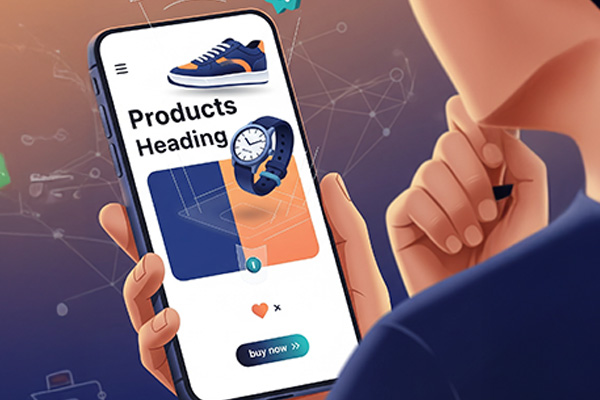
- Product or service launches
- Rebrands or redesigns
- Campaigns or collections
- Events or collaborations
- Exclusive content or limited editions
Keys to designing powerful visual teasers
1. Design for curiosity, not confusion
Mystery is a tool—not the goal.
A strong teaser reveals just enough to make people want more.
Examples:
- Show only a silhouette, texture, or detail
- Partially hide the logo
- Use question-driven copy (“Are you ready to rediscover your brand?”)
💡 Esbozo tip: Use layers, blur, and masking to simulate something about to be revealed.
2. Stay consistent with your brand identity
Even if the tone is more intriguing, the teaser must feel like your brand.
This ensures:
- Instant recognition
- Anticipation without disconnect
- Narrative continuity when you reveal
Colors, typography, and style should evolve—not break.
3. Design for multiple platforms (and phases)
A teaser doesn’t live in one place.
Adapt the same concept to:
- 5-second Reels or Shorts
- Stories with countdowns
- Carousel posts with progressive reveals
- Landing pages with partial or loading visuals
And release in phases:
- Initial teaser
- Reveal teaser
- Interactive teaser
4. Add interaction
A teaser shouldn’t just show—it should invite.
Ideas:
- Hidden clues or codes
- Polls (“What do you think it is?”)
- Visual challenges (“Find the hidden logo”)
- Countdown experiences
This turns users into participants—not spectators.
5. Use motion design strategically
Teasers are perfect for movement.
Examples:
- Logo forming partially
- Zoom into textures
- Letters completing slowly
- Reveal-based transitions
🎥 Keep it short: 5–10 seconds max. Anything longer weakens the impact.
Common mistakes
- Being too cryptic → no one understands
- Breaking brand identity “for creativity”
- Using generic phrases (“Coming soon” ≠ strategy)
- Revealing too much too early
- No clear CTA (“Discover more”, “Set reminder”, etc.)
Suggested teaser structure
- Strong opening visual
- Intriguing element (question, partial message)
- Subtle hint (color, word, symbol)
- Clear visual CTA
Brands doing it right
- Netflix → ultra-short, visually consistent teasers
- Apple → silhouettes, textures, minimal clues
- Esbozo (you) → blurred previews, process reveals, incomplete visuals
Conclusion
Memorable launches are built before they happen
A great teaser doesn’t just create hype—it creates emotional anticipation.
In a world competing for attention, the teaser is the spark that activates a community before the launch.
At Esbozo, we believe in the power of strategic design—even when showing “just a part.”
Because sometimes…
what you don’t reveal is what people remember most.