To talk about Saul Bass is to talk about the origin of modern graphic design as we know it today. He was one of the first to prove that design was not just decoration, but strategic, narrative, and emotional communication.
His work went beyond posters and branding, transforming even the language of cinema by introducing the concept of the opening sequence as visual art.
This article explores how Saul Bass’s vision continues to influence the way we think about visual identity, typography, and motion as a design language.
1. A Designer Who Thought Like a Director
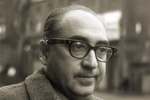
Saul Bass was born in New York in 1920, during the golden age of American industrial design.
From an early age, he showed an uncommon artistic sensitivity, influenced by the Bauhaus, Russian constructivism, and Swiss design. However, what set him apart was not his technique, but his cinematic vision of design.
Bass didn’t see design as something static, but as a story in itself.
His compositions were filled with tension, rhythm, and visual direction. Every stroke and shape was part of a narrative.
👉 In Bass’s own words:
“Design should reach the heart of an idea, not just its surface.”
2. He Revolutionized Film Design
Before Saul Bass, film titles were just a formality.
After him, they became a narrative visual experience.
His collaborations with directors like Alfred Hitchcock, Otto Preminger, and Martin Scorsese forever changed how audiences were introduced to a story.
Iconic sequences designed by Bass:
- Vertigo (1958) — hypnotic spirals symbolizing obsession
- Anatomy of a Murder (1959) — a fragmented silhouette moving to the rhythm of jazz
- Psycho (1960) — aggressive lines slicing across the screen like knives
Each opening sequence was a visual metaphor for the story—condensing the essence of the film into a few seconds of typographic motion and pure form.
3. The Visual Language of Simplicity
Saul Bass’s style was direct, minimal, and symbolic.
His genius was in saying everything with almost nothing.
While other designers filled space, Bass reduced it to its essentials to highlight the core idea.
His most recognizable visual traits:
- Use of basic geometric shapes (triangles, lines, spirals)
- Handcrafted, irregular typography with a human feel
- Flat, high-contrast colors—especially black, red, and white
- Composition driven by concept, not ornamentation
His style became so powerful that it transcended cinema and became a benchmark in corporate branding.
4. Logos That Stand the Test of Time
Beyond film, Saul Bass designed some of the most enduring logos of the 20th century—many still in use today.
His approach focused on creating timeless symbols that communicated a brand’s essence without relying on trends.
Some of his most iconic logos:
- AT&T (1969) — the iconic blue globe symbolizing global connection
- United Airlines (1974) — an abstract form representing wings and motion
- Warner Communications (1972) — a solid, symmetrical structure based on visual balance
- Minolta (1978) — simple typography paired with a stylized sun symbol
His legacy proves that a great logo doesn’t age—it evolves with dignity.
Bass didn’t design for trends. He designed for permanence.
5. The Thinking Behind the Form
Saul Bass believed that design should start with meaning, not appearance.
His creative process began with a fundamental question:
“What story do I want this form to tell?”
This mindset made him a pioneer of visual storytelling long before the term became popular.
Every poster and title carried deep conceptual weight—a symbolic layer that invited the viewer to think.
That’s why his work is still studied in design schools—not just for its aesthetics, but for its intellectual clarity.
6. Influence on Contemporary Design
Saul Bass’s impact can be seen across generations of designers and art directors.
His minimalist and narrative approach has influenced brands, campaigns, and motion design studios worldwide.
Examples of his influence today:
- Title design in series like Mad Men or Stranger Things
- Visual identities like Google Doodles or Airbnb animations, inspired by conceptual motion graphics
- The rise of narrative motion design, where animation conveys emotion rather than just effects
Bass paved the way for understanding design as a sensory and emotional experience—not just a visual one.
7. His Legacy: Clarity, Emotion, and Purpose
Saul Bass passed away in 1996, but his legacy lives on in every screen, logo, and poster that seeks to balance simplicity and meaning.
His work proved that design can tell stories, evoke emotion, and endure—without excess.
In an era saturated with stimuli, his philosophy is more relevant than ever:
“Design is thinking made visible.”
Conclusion: The Designer Who Taught Us to See
Saul Bass didn’t just design images—he taught us how to see.
He showed the world that behind a line there can be emotion, behind a color an idea, and behind motion an entire story.
At Esbozo, we recognize Saul Bass as one of the pillars of contemporary visual thinking—a designer who understood that the power of design lies not in form, but in the meaning it conveys.